Red Access
Solving the Security - Productivity Paradox
Solving the Security - Productivity Paradox
Red Access is a cybersecurity platform that helps organizations secure web activity, SaaS applications, sensitive data, and AI usage without requiring browser modifications, agents, plugins, or complex network migrations. The platform introduces a lightweight approach to Secure Service Edge (SSE), allowing organizations to achieve enterprise-grade security while preserving the browsing experience employees already use every day. As Head of Design and Senior Product Designer, I led the product design effort from product strategy and user experience architecture to interface design, design systems, and data visualization.
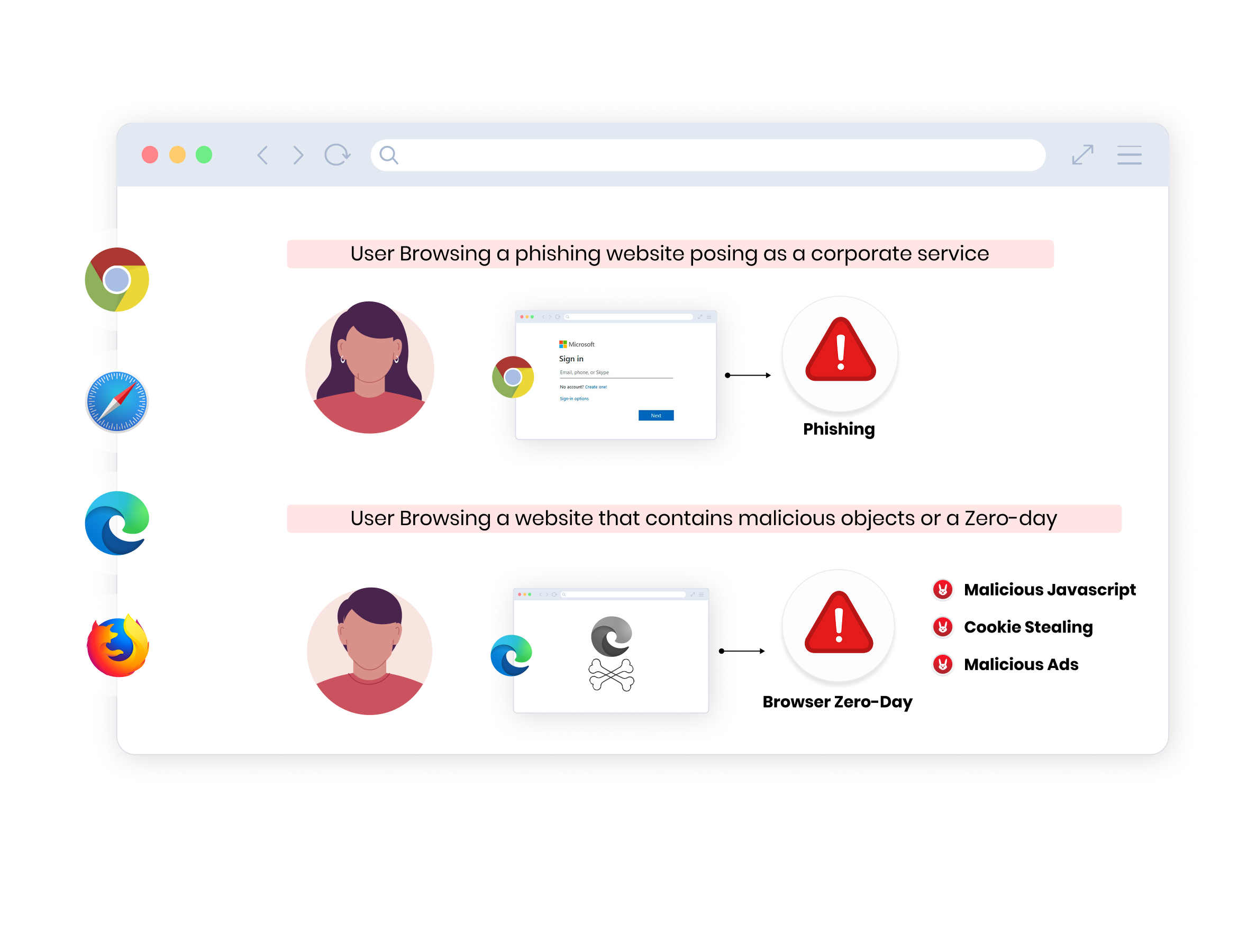
Enterprise security teams face a difficult tradeoff. Traditional SSE solutions often require lengthy deployments, infrastructure changes, network rerouting, and significant operational overhead. At the same time, newer browser-security solutions frequently focus on a limited part of the problem and fail to provide complete visibility and protection.
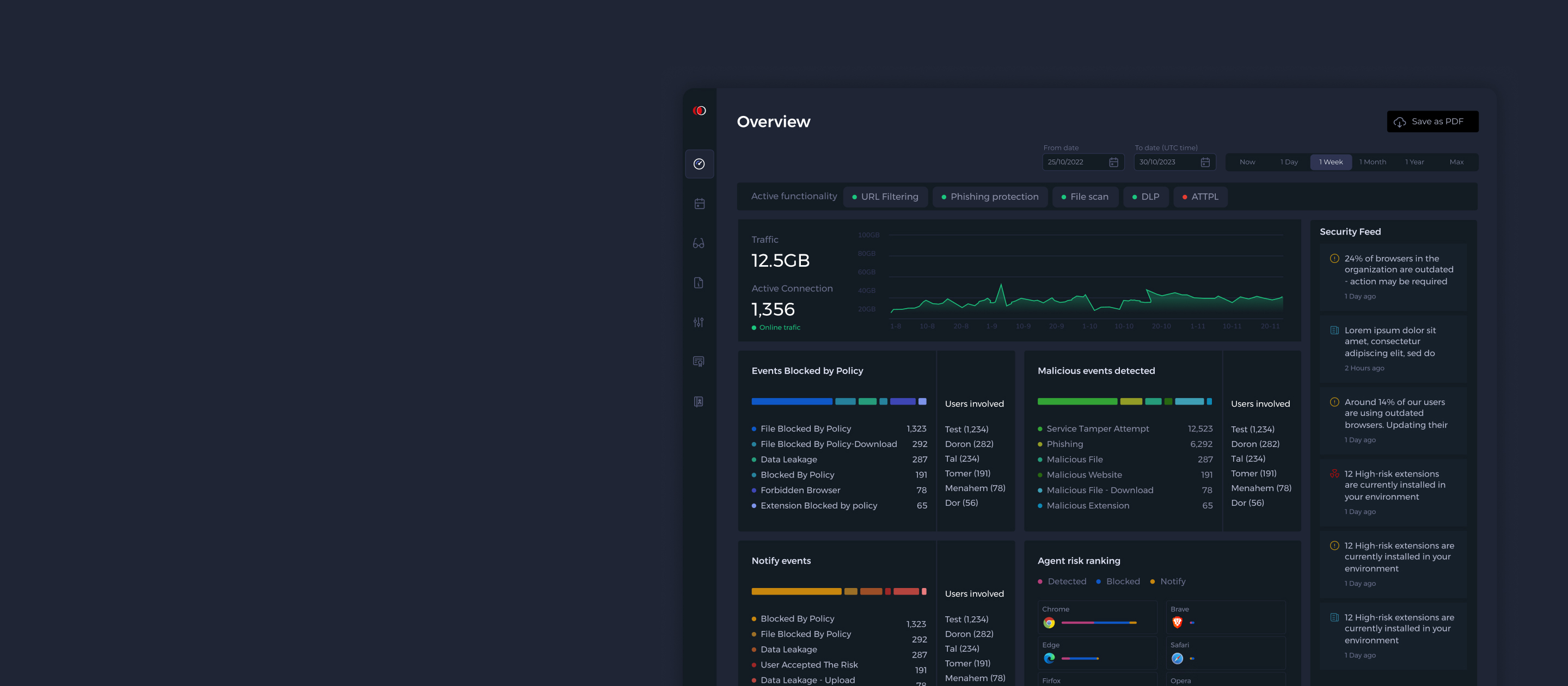
The challenge was to design a platform that delivers deep security capabilities while remaining lightweight, approachable, and easy to operate. More importantly, we needed to transform highly technical security data into actionable insights that security teams could understand within seconds.
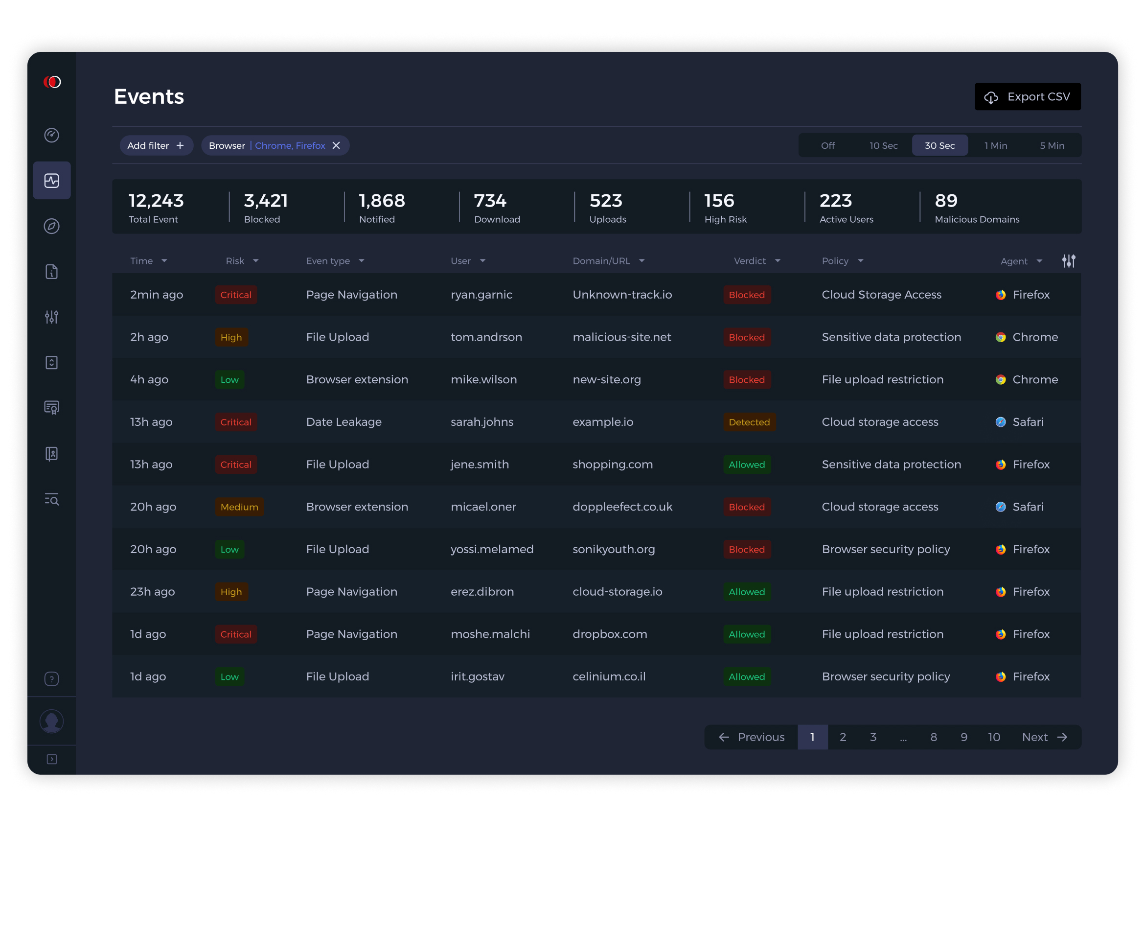
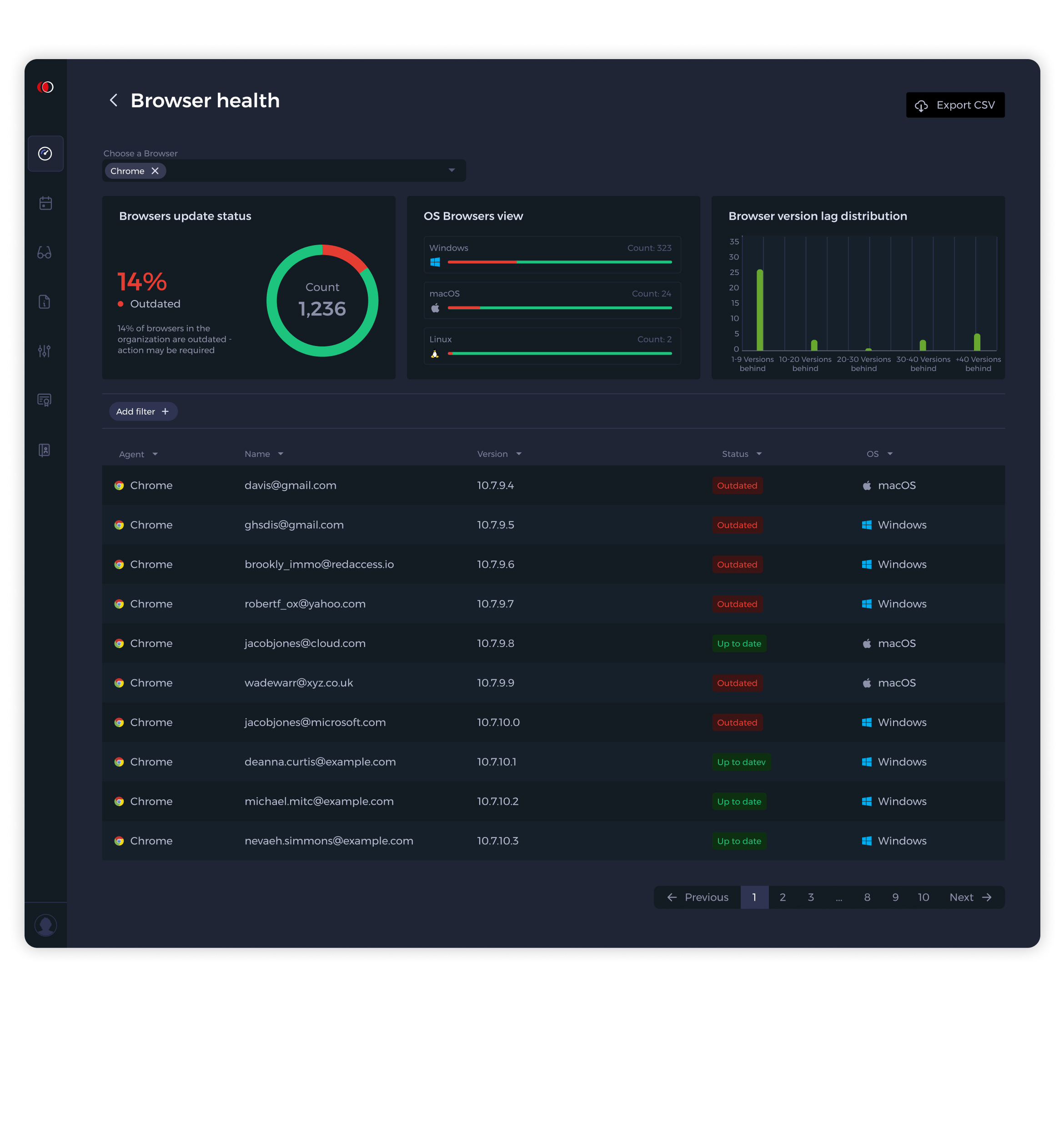
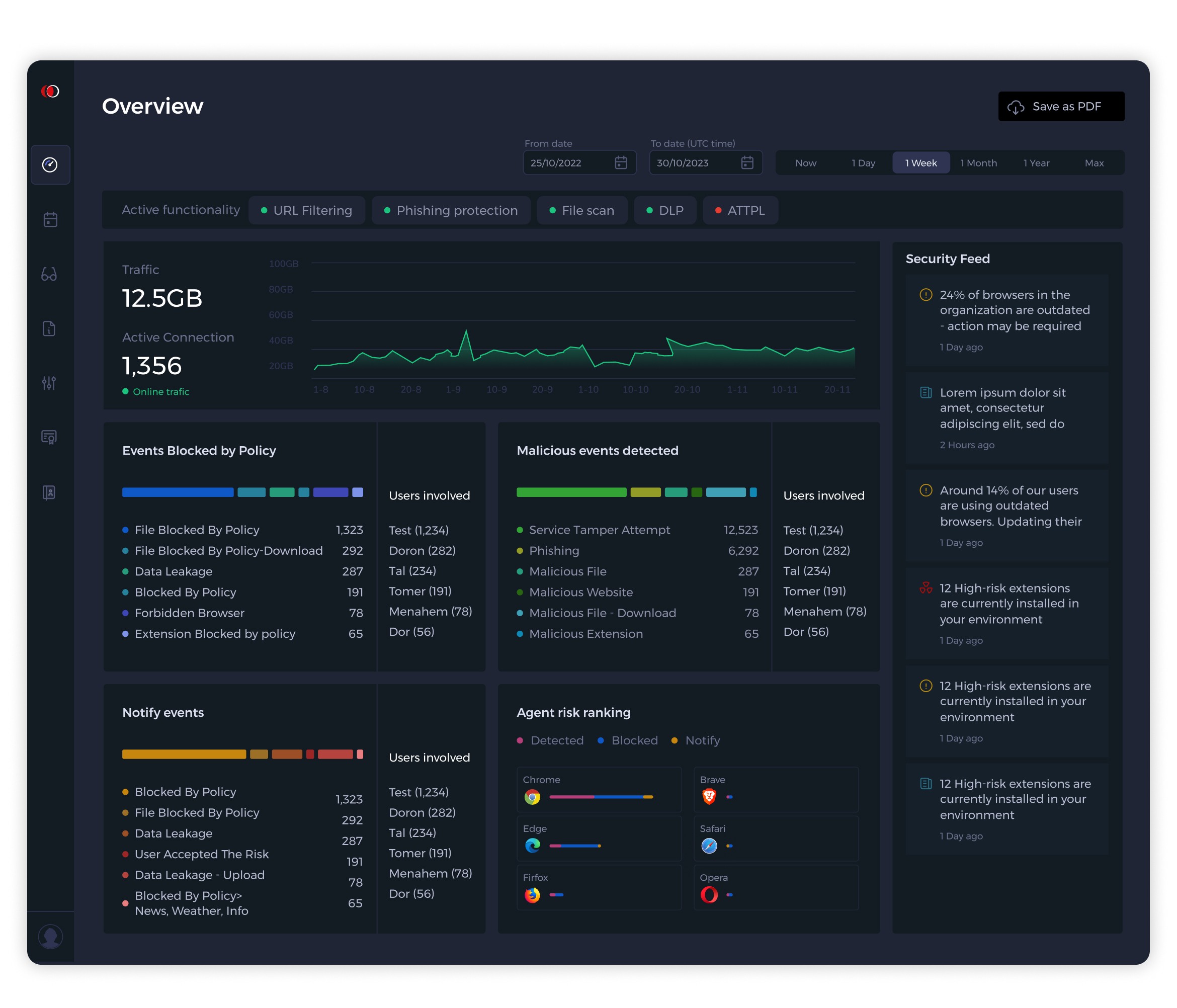
One of the recurring themes throughout the project was visibility. Security teams receive an overwhelming amount of information every day, and struggle to identify what actually requires attention.
Instead of presenting users with endless logs and technical records, I focused on creating a layered experience that surfaces the most important signals first while allowing deeper investigation when necessary. The result was a product that helps security teams move naturally between monitoring, analysis, and response.
Most organizations already have access to vast amounts of security data. What they often lack is the ability to connect the dots. A suspicious domain, a policy violation, an outdated browser, and a risky file upload may appear as separate events, even though they are all part of the same story. How can we help users reveal said relationships?
Rather than designing individual screens, I focused on creating a connected investigation experience where every piece of information could lead naturally to the next. This transformed the product from a monitoring tool into a decision-making tool.
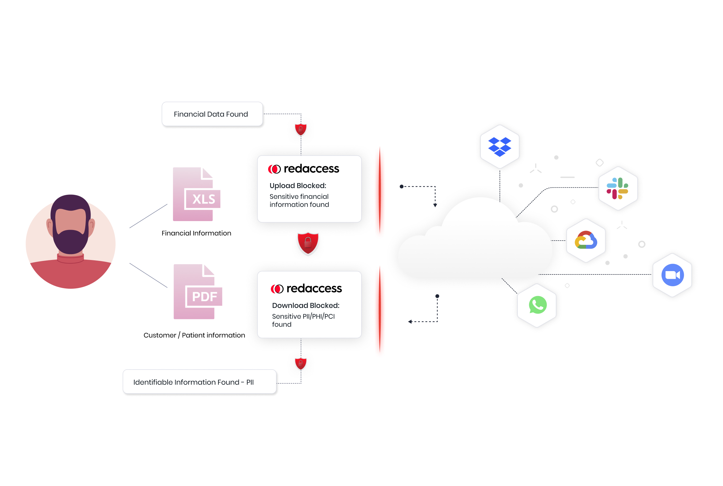
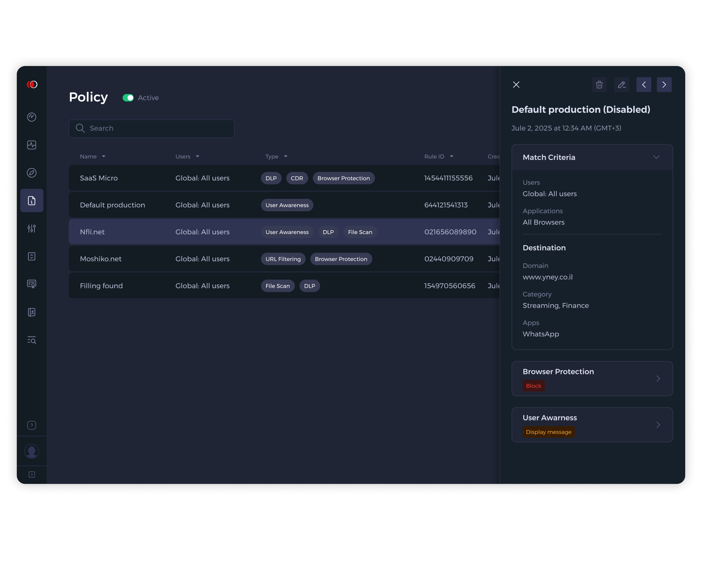
Policy management is often where security platforms become difficult to use.
Throughout the project, I focused on reducing the cognitive load associated with creating, understanding, and maintaining security policies. Rather than exposing technical configurations as isolated rules, policies were presented within their operational context, helping administrators understand exactly who is affected, what is protected, and why a policy exists.
One of the challenges was not only designing a product, but helping define a new category. Instead of competing directly with traditional browser isolation or DNS filtering solutions, Red Access introduced a different approach: real-time browser protection without the latency and operational overhead associated with legacy security tools.
One of the biggest challenges was balancing simplicity with depth. Cybersecurity professionals require access to enormous amounts of information, yet presenting everything at once quickly creates noise and confusion. The design process focused on progressively revealing complexity, allowing users to start from a high-level understanding and move deeper only when necessary.
Another challenge was creating consistency across multiple product areas, including browser security, event monitoring, DLP, policy management, threat detection, SaaS security, and reporting.
Building a unified design language became essential for making the platform feel cohesive despite the breadth of capabilities.
This project taught me that great design is not about showing more information - it's about reducing doubt. This project's triumphs manifested themselves in the form of decisions and features that helped users reach clarity faster, understand a risky situation, and trust the decisions they were making.
The more complex the system becomes, the more human the design needs to be. Technology, security, and data may be at the center of the product, but confidence, trust, and understanding are what ultimately create a great user experience.
Available for senior product design roles at companies
building complex, data-heavy products.